You are using an out of date browser. It may not display this or other websites correctly.
You should upgrade or use an alternative browser.
You should upgrade or use an alternative browser.
OT Central LOGO!
- Thread starter sbcanada
- Start date
outside looking in
<b>Registered Member</b>
ris,
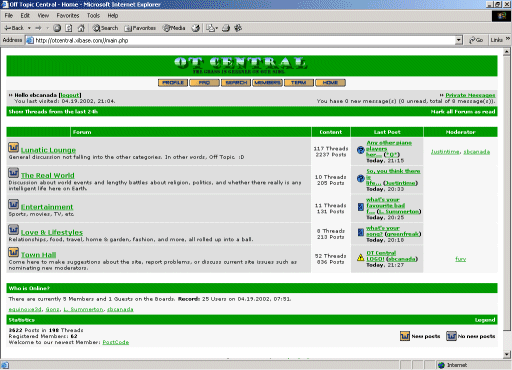
Yeah, I was thinking it was just going to be inserted in the middle of the header bar... that would look pretty strange.
I think it would look good on either the right or left sides (doesn't seem like something symmetric that should be in the middle, but I'm no architect ). I assume you're intending to extend the "pattern" across the entire header... that would look pretty good.
I'm still wondering how it will look with all of the other plain-ass blocks of green around. I would probably have to see it to be able to get a good idea... I've never been good with visualizing colors.
Yeah, I was thinking it was just going to be inserted in the middle of the header bar... that would look pretty strange.
I think it would look good on either the right or left sides (doesn't seem like something symmetric that should be in the middle, but I'm no architect
I'm still wondering how it will look with all of the other plain-ass blocks of green around. I would probably have to see it to be able to get a good idea... I've never been good with visualizing colors.
ris
New Member
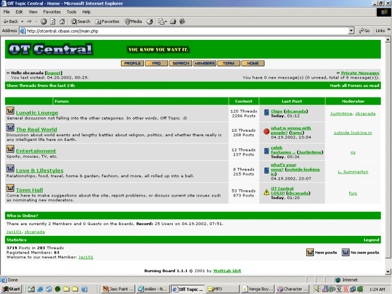
the question of positioning has been going through my mind and i'm still not sure quite what the solution is. as i said my intention was always to just take over the whole bar [designer meglomania  ], but that might not be the best approach.
blending in is less of a problem i think, as long as the background shades are based on [or actually contain block of] the green that forms the borders of the rest of the site.
perhaps i'll do a mu fu style screenshot to see if it works.
it's amazing how somehting so straightforward can get so complex when you really think about it
*edit - if it is on either side then it's on the right, that much i do know
outside looking in
<b>Registered Member</b>
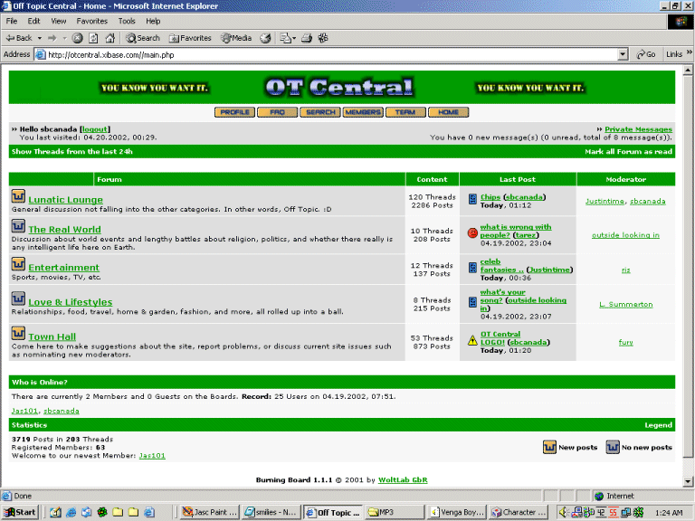
Yeah, I was thinking right as well - looked like you intended it to be that way. I guess you could center otcentral on the header, and fill in on each side... but I kind of like the way it looks now.
outside looking in
<b>Registered Member</b>
yeah, that looks pretty good. I like how it blends to the left back into the site green.
Justintime
Guest
Ris, i like! 
Justintime
Guest
no offense, but i think ris's looks the best 


.gif)


