
You are using an out of date browser. It may not display this or other websites correctly.
You should upgrade or use an alternative browser.
You should upgrade or use an alternative browser.
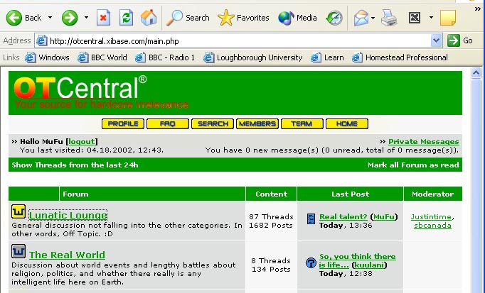
OT Central LOGO!
- Thread starter sbcanada
- Start date
outside looking in
<b>Registered Member</b>
I kind of like that ris... though, just a bit more might not hurt... like spelling out "Central." Other than that, very tasteful.
MitchSchaft
New Member
I like "Where the geeks relax" and "Let freedom ring". Both have a lot of meaning concerning us.


sbcanada
New Member
Originally posted by Gonz
Damn SB, give me a chance will ya---no on the second choice.
Sorry man, just thought I'd give you some suggestions...
")
sbcanada
New Member
You can upload it to a different site, and then put the image into a message here.
http://www.boomspeed.com/ is a good host.
http://www.boomspeed.com/ is a good host.

outside looking in
<b>Registered Member</b>
ris,
That's perfect.
I'm concerned about how the color will blend in with the heading bar? Perhaps the layout of the page could be altered so that it works fine. ?(
That's perfect.
I'm concerned about how the color will blend in with the heading bar? Perhaps the layout of the page could be altered so that it works fine.
?(ris
New Member
my guess is that you are thinking of a centrally located logo where the current words are, while the design is for the entire header bar, which is a little cheeky on my part D
good point though, the intention was [and this is where the rgb stuff came in] to match the green of the site in the vertical line that sits behind the 't' of ot.
best thing to do is define how you see the logo working [central at the top or entire header, repeated at other parts of the site, that sort of stuff]