
You are using an out of date browser. It may not display this or other websites correctly.
You should upgrade or use an alternative browser.
You should upgrade or use an alternative browser.
OT Central LOGO!
- Thread starter sbcanada
- Start date

outside looking in
<b>Registered Member</b>
Wow, seven posts in a row!
But I still like ris's.") It's just so classy and elegant. It would really set this forum apart from the dozens of others out there (as far as looks anyway).
It's just so classy and elegant. It would really set this forum apart from the dozens of others out there (as far as looks anyway).
But I still like ris's.
It's just so classy and elegant. It would really set this forum apart from the dozens of others out there (as far as looks anyway).outside looking in
<b>Registered Member</b>
I tried to make a logo. I'm no artist or photoshop prodigy, so I did what I do best... CAD!
I had a pretty cool 3d textured semi-transparent logo that was pretty sweet looking when OGL rendered spinning around... but it looks pretty lame when sitting still (kind of like a someone tried to make a 3d text in photoshop or something). There's just no one angle it looks good at, but when it's spinning, it looks natural.
Oh well, I still like ris's anyway.
The image has to fit into a 640x480 browser without scrolling horizontally and not be too high, as excessive having to scroll will piss off people who don't have a mouse wheel to scroll easily with. So, about 620x80 or so would be the max size... smaller the better..
Current one is 34 pixels high, but I do like ris's spiffy nice logo
Current one is 34 pixels high, but I do like ris's spiffy nice logo


outside looking in
<b>Registered Member</b>
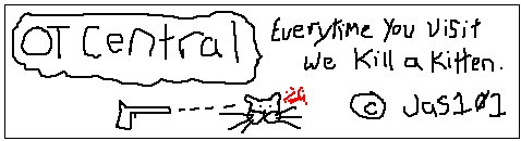
Nice Jas101, that might get my vote! 
